Reviewed 2013-06-28 l Last update on 2023-08-26

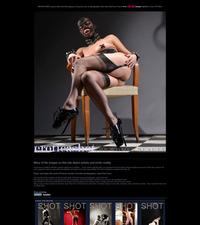
You are about to enter the erotic world of photographer Jean Paul Four. At Erotica Shot he presents us with unique and high class photographs that are stylish and erotic. It's all about photography here, and the work is excellent quality and exclusive. It's black and white and colour and there is a fetish age to it all as well. The site itself is nicely produced and easy to use and so nothing distracts you from the great looking models and the great photos.
You sign up and sign in and find yourself at a very simple looking members' area. The tour is quite complicated by comparison. In fact, the members' area is very basic indeed with one long wall of thumbnail images, a drop-down category list and only the most basic of texts. When you want to find out anything else then you need to look around the tour pages, but when you want to see the photos then you simply sign in and start clicking the images.
There were 326 separate galleries when I was in the site, all set out in rows for five thumbnails down the one main page. Some were shown with a bright pink border and the titles Multi gallery and these are made up of various shots from various shoots. The other galleries are all of the same theme or session. You only have to click a thumbnail to see the gallery and then click another one to open the image you want to see.
Images opened up to the size of the screen, at around 900 x 600 they fitted on it fine, and they come with basic forward and back buttons. If you want any info about the images then you have to put your mouse over the main page thumbnail for the set; then you see the embedded Alt text for that thumbnail and this tells you the info about the set. It's a novel way of doing it and there isn't a lot of info here but at least you get some; there is none with the actual gallery or individual images.
Galleries don't hold many images each, to start with, probably around six to eight as an average. But when you then click on the first you find that it leads to a further seven or so, so in fact you have around 30 to 40 pics per set, sometimes as many as 90. Numbers do vary and when you point your mouse to the main page thumbnail you are often told how many pics per set to expect. It is a bit of a confusing set up but once you are used to it it's easy enough to handle.
But the photography is the thing here. You certainly do have excellent work and it is very moody and atmospheric. You will find fetish shots, men in hoods and with implements and women in submissive roles. You will find solo ladies in poses showing all, and you will find lesbian shoots as well. There is always something dark and almost menacing about the lighting, which is perfect, and there is a definite style to Fours work. The monochrome shots work superbly, and the colour shots as well, and there is variety in the models. Mainly the girls are sleek and slender and act out their roles well; sometimes you have older, fatter women who are just as sexy in this lighting and with this genius behind the camera. It is a big, wide mix of images, with mainly a fetish bent and always top class.
I have to say that this site is very basic in terms of navigation and design. Some of the older galleries (I assume they are older as they are further down the main page, but there are no dates given), open in a pop-up box while the newer ones open in the same window/tab. You often have to use your back button a little to get back to the main page as there are no direct links back to the main page, and there are no slideshows or zip files either.
There is very little information. The only notes I found were hidden behind the thumbnails and only appeared when my mouse was over the image. There is no text with each individual gallery or image. And similarly there is no info on the models, no model index and no background, other than what you might find on the tour.
Youre not able to be interactive either as there are no comments or rates, no forum and nowhere to leave feedback, though there is a note and a link offering you the chance to email in comments. There is one drop-down list of categories in the top left corner of the page which mixes models names with category headings and produces the solo images that are attached to each.
But other than that, this really is a very basic site where you call in, view pics and save them one at a time if you want and then move on. But it is the style and quality of those images that make it worth joining.
For a gallery only site I would expect more of a gallery themed set up from the design: details, various image sizes, slideshows, zip files, models names, type of camera, when taken and all that kind of thing. What Erotica Shot gives us are some stunningly wonderful and very erotic shots of naked women, some bondage and other fetish shoots and some great imagination fuel; and it gives it to us in a very simple to use members' area that could benefit from an upgrade.